Expert Picks for a Stylish Refresh

Welcome to the Future of Kitchen Design:
Choosing the perfect kitchen paint color can be overwhelming, but 2025’s trends make it exciting! This year, designers are blending timeless neutrals with bold, earthy hues to create spaces that feel both fresh and enduring. Whether you’re planning a full remodel or a weekend refresh, these expert-backed colors will change your kitchen. They will turn it into a stylish sanctuary. Let’s dive in!
1. Forest Green: Nature’s Elegance
Why It’s Trending: Studio Green by Farrow & Ball No.93 s 2025’s answer to sophistication. This deep, organic hue channels the serenity of nature while adding a touch of luxury. As color expert Annie Sloan notes, “Forest Green complements wood and marble beautifully, creating a grounded yet polished look.”

How to Use It:
- Pair with: Brass or gold hardware for warmth.
- Try Shades Like: Amsterdam Green or Olive for cabinetry or accent walls.
- Pro Tip: Balance dark greens with light counter tops or open shelving to avoid a cramped feel.
2. Oberon: The Rise of Deep Purple
Why It’s Trending: Move over, neutrals—Oberon’s rich purple is stealing the spotlight. Design duo Still Johnson calls it “a luxurious choice that pairs perfectly with walnut cabinetry or terracotta floors.”

How to Use It:
- Pair with: Warm accents like Farrow & Ball’s Brinjal (#222) for walls or lower cabinets.
- Unexpected Twist: Use it in a matte finish for modern depth.
- Pro Tip: Offset bold purple with creamy whites on upper cabinets to keep the space airy.
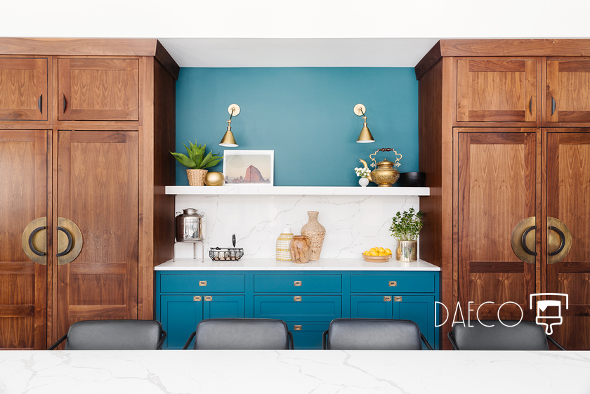
3. Blue-Greens: Calm Meets Character
Why It’s Trending: Blue-greens like Farrow & Ball’s De Nimes (#299) offer versatility, shifting tones under different lighting. “Its earthy undertones harmonize with brass and stone,” say Still Johnson designers.

How to Use It:
- Pair with: Natural wood bar stools or marble back splashes.
- Lighting Hack: Use warm bulbs to emphasize green tones; cool bulbs for a bluer cast.
- Pro Tip: Perfect for open-concept kitchens seeking a serene transition to living areas.
4. Rich Reds: Warmth & Energy
Why It’s Trending: Red is back, and it’s bolder than ever. Benjamin Moore’s 2025 Color of the Year, Cinnamon Slate, leads this spicy resurgence. Annie Sloan loves red’s ability to “make kitchens feel cozy and luxurious.”

How to Use It:
- Pair with: Matte brass hardware and terracotta tiles for rustic charm.
- Subtle Approach: Paint a single island or show shelves for pops of color.
- Pro Tip: Balance red with neutral walls to avoid overwhelming the senses.
5. Soft Browns: The New Neutral
Why It’s Trending: Soft browns like Annie Sloan’s Honfleur On Fleur bring ’70s warmth into 2025. “These tones create a calming base for textured finishes,” she explains.

How to Use It:
- Pair with: Pink or taupe accents for a muted, inviting palette.
- Texture Play: Combine with matte stone counters or woven light fixtures.
- Pro Tip: Use brown on lower cabinets and white uppers for a balanced, modern look.
6. Dark Moody Blues: Timeless Drama
Why It’s Trending: Oxford Navy and similar shades add depth and intimacy. “Dark blues are endlessly sophisticated,” says Sloan, especially with gold accents.

How to Use It:
- Pair with: Marble counter tops and metallic pendant lights.
- Small Space Fix: Use navy on a feature wall to add drama without closing in the room.
- Pro Tip: Glossy finishes mirror light, keeping the space vibrant.
7. Black: Bold & Refined
Why It’s Trending: Black mill work is 2025’s ultimate statement. Still Johnson recommends Benjamin Moore’s Black Beauty for “a French-industrial vibe that pairs with wood and brass.”

How to Use It:
- Pair with: Open shelving or a butcher-block island to soften the contrast.
- Hardware Matters: Polished chrome or aged brass adds luxe contrast.
- Pro Tip: Keep walls light to let black cabinetry shine as the focal point.
Conclusion: Your Kitchen, Your Canvas
2025’s kitchen colors invite you to experiment—whether with Forest Green’s organic elegance or Oberon’s daring purple. Remember, the best palette reflects your style. Ready to transform your space? Start with a sample pot and test colors in different lights.
Loved this guide? Share your favorite pick in the comments, and follow for more design inspiration!


Leave a Reply